There’s a distinct heartbeat to a vintage ice hockey print that no modern reproduction can quite copy. It isn’t only the subject — the scarred boards, a faded crest, a heavy wool sweater — but the way those elements are presented: muted palettes pulled from older inks, a paper surface that reads as lived-in, typography that speaks of a simpler, tougher era. Those visual cues work together to turn an image into a memory, and a poster into a piece of room identity.
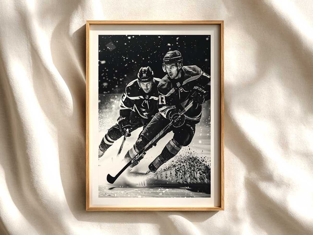
Look closely at the sweaters and crests in vintage hockey posters and you’ll see why collectors respond so strongly. The cut of the sweater, the imperfect stitching suggested by brush strokes or screen dots, the emblem placed slightly off-center — these are signposts of authenticity. They recall locker-room rituals and local rivalries rather than glossy, corporate branding. That specificity is crucial: it anchors the viewer in a narrative of teams, towns and hard ice, rather than in a stylized homage that could belong to any sport.
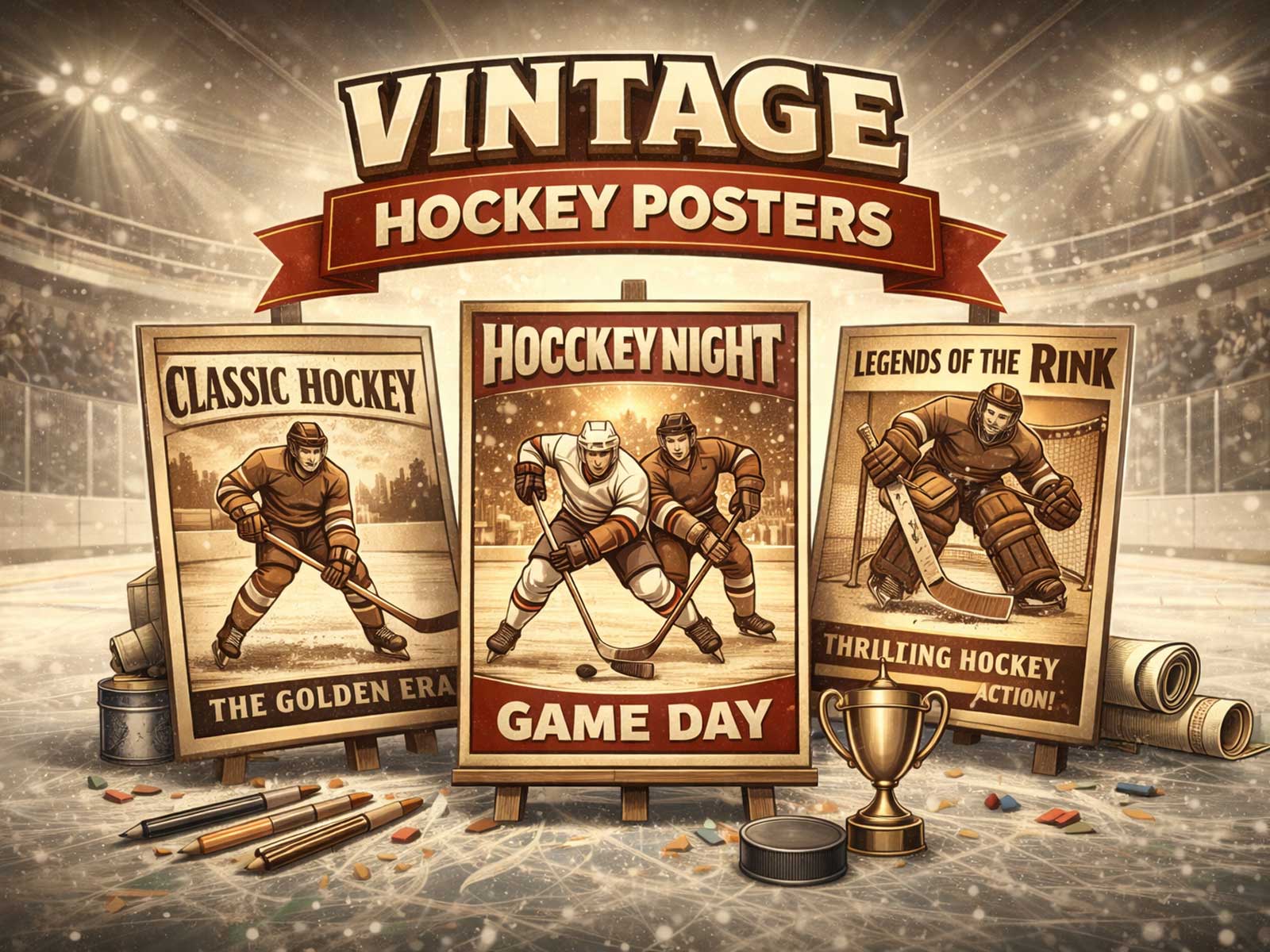
Equally important is color. Retro hockey palettes are not simply washed-out versions of modern hues; they are a carefully constrained set of tones born from older printing processes and mid-century design thinking. Deep maroons, bottle greens, mustard golds and ink-blued blacks age into softer harmonies when printed on textured stock, creating a warmth that reads as vintage even when newly produced. Those colors pair with paper grain and simulated foxing to suggest time and use — the visual shorthand for ‘‘this belonged to someone before you.’p>
[IMAGE_INSERT_ARTICLE_01]
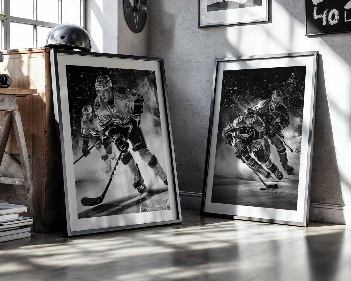
Texture is the secret language of authenticity in these prints. A visible halftone, a subtle off-register line, or the soft abrasion of an artificially distressed corner does more than imitate age; it creates an emotional register. It invites touch and memory, prompting the viewer to imagine handling a ticket stub, folding a program, or tracing a player’s number with a thumb. That tactile suggestion gives the artwork weight on the wall: it feels like an heirloom rather than a decorative afterthought.
Typography and layout play a quiet but essential role. Vintage hockey pieces often borrow from mid-century sports advertising — bold condensed headlines, spare captions, and utilitarian spacing that emphasize clarity over flourish. The result is a visual rhetoric of strength and purpose: the poster reads like a proclamation. When placed in a den, office or fan room, it becomes an emblem of taste as much as fandom, a way to signal a preference for history and grit over glossy nostalgia alone.
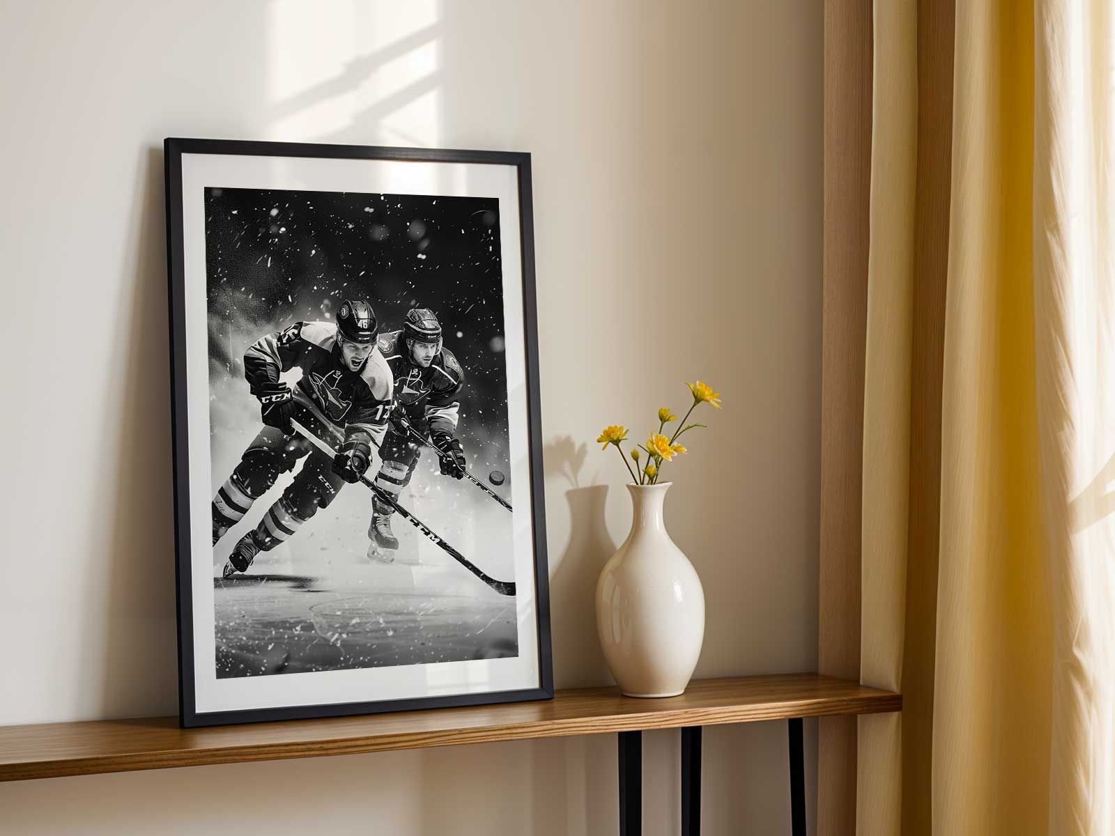
Beyond aesthetics, the emotional pull of these prints is what really cements their decorative power. They act as triggers for collective memory: for older fans, they conjure Sunday nights, rinks that smelled of linseed oil and metal, and the visceral thrill of a check along the boards; for younger fans, they offer a romanticized window into a sport that feels more physical, less mediated. That layered appeal — personal and aspirational — is what makes a vintage hockey print work in diverse interiors. It can be the anchor of a minimalist office or the keystone of a busy collector wall.
Finally, genuine vintage styling resists the trap of generic „retro.” Authenticity comes from specificity: the right crest, the believable wear pattern, and a palette that nods to historical processes rather than a trendboard. Posters that get those details right reward the viewer with a credible story and a strong visual personality. In short, a well-made vintage ice hockey print is decoration with a voice — it tells who you are as a fan and what you value as a collector, all while giving any room an instant, enduring character.