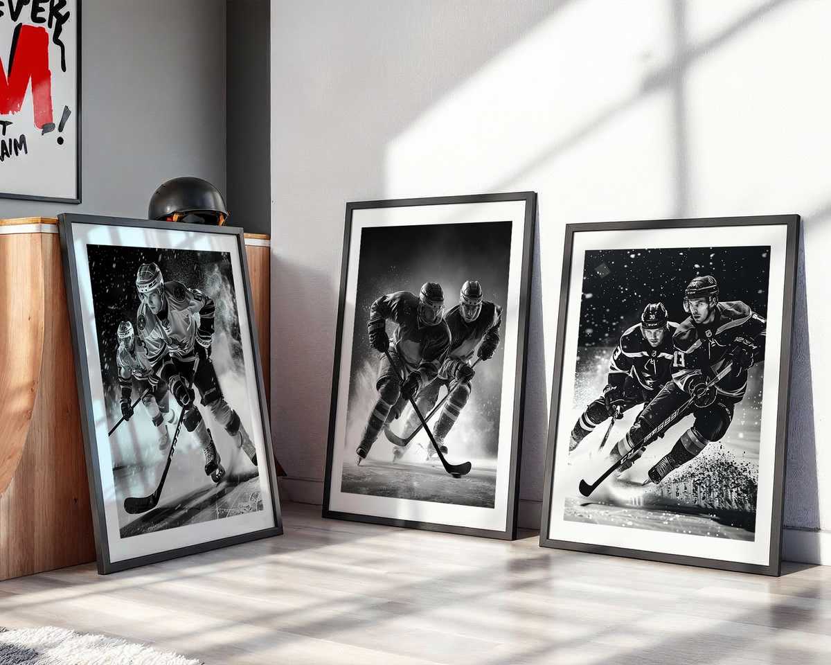
Hockey translates to wall art with a rare directness: everything that makes the sport visceral—raw speed, hard edges, satin ice, and compressed emotion—also reads immediately in a framed image. A successful hockey artwork does not need to romanticize the game to be beautiful; it needs to preserve the truth of motion and material and to choose the moment that carries a room. That truth is what convinces both fans and design-minded viewers that this is more than a poster: it is a mood, a rhythm, a place set aside in the home for intensity.
The first ingredient is motion made legible. Skates carve diagonals across the frame, jerseys flare, and bodies lean into invisible vectors of force. A photographer or illustrator who understands these lines can freeze a posture that reads like an arrow: the torso pitching, the stick slicing through air, a spray of ice suspended like a crystalline manuscript of motion. In wall art, those decomposed instants become dynamic compositions rather than mere snapshots. The viewer’s eye follows implied trajectories, and the image keeps giving as you look—like good music, it reveals structure on repeated visits.
Ice as material is a visual superpower. Its reflective surface amplifies color and contrast, turning a dark jersey band into a bold graphic and a single floodlight into a painterly highlight. The granular texture of snow and skate spray can be rendered in exquisite detail or suggested with painterly brushwork; either approach preserves the tactile honesty of the rink. When reproduced at poster scale, the ice’s subtle sheen reads as atmosphere: it cools a warm living room, sharpens lines in an office, and gives a game room an edge that other sports rarely provide.
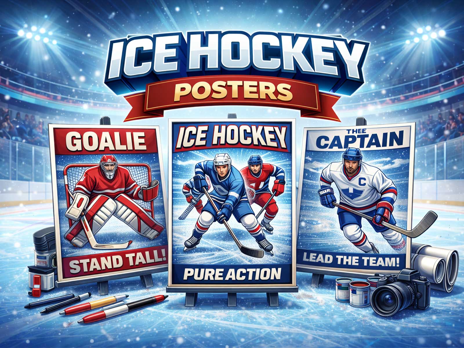
[IMAGE_INSERT_ARTICLE_01]
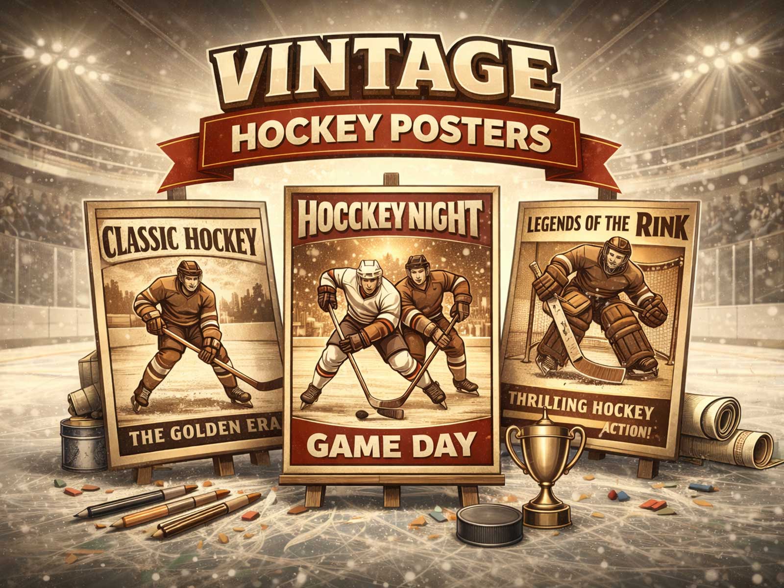
Color and identity matter because hockey lives in crests, stripes, and number fonts. Team colors are shorthand for loyalty and memory; a well-composed artwork uses them like a palette, balancing saturated jerseys against the neutral architecture of the rink. Retro treatments—muted inks, film grain, simplified crests—offer nostalgia and a decorative calm, while modern, high-contrast treatments emphasize speed and aggression. Both have places in interiors: vintage posters sit comfortably in a study or a collector’s wall, while bold contemporary prints energize a basement bar or a minimalist loft.
Emotional density is the third axis. Hockey scenes are small theaters: an offensive rush, a goalie split, the caught expression of a player mid-check. Choosing an image that carries narrative—an imminent goal, a moment of contact, a look of resolve—lets the artwork hold a story without text. This narrative power is what makes hockey posters meaningful beyond fandom; they become portraits of tension and release that resonate in personal spaces, turning a bedroom or office into an environment that feels alive and intentional.
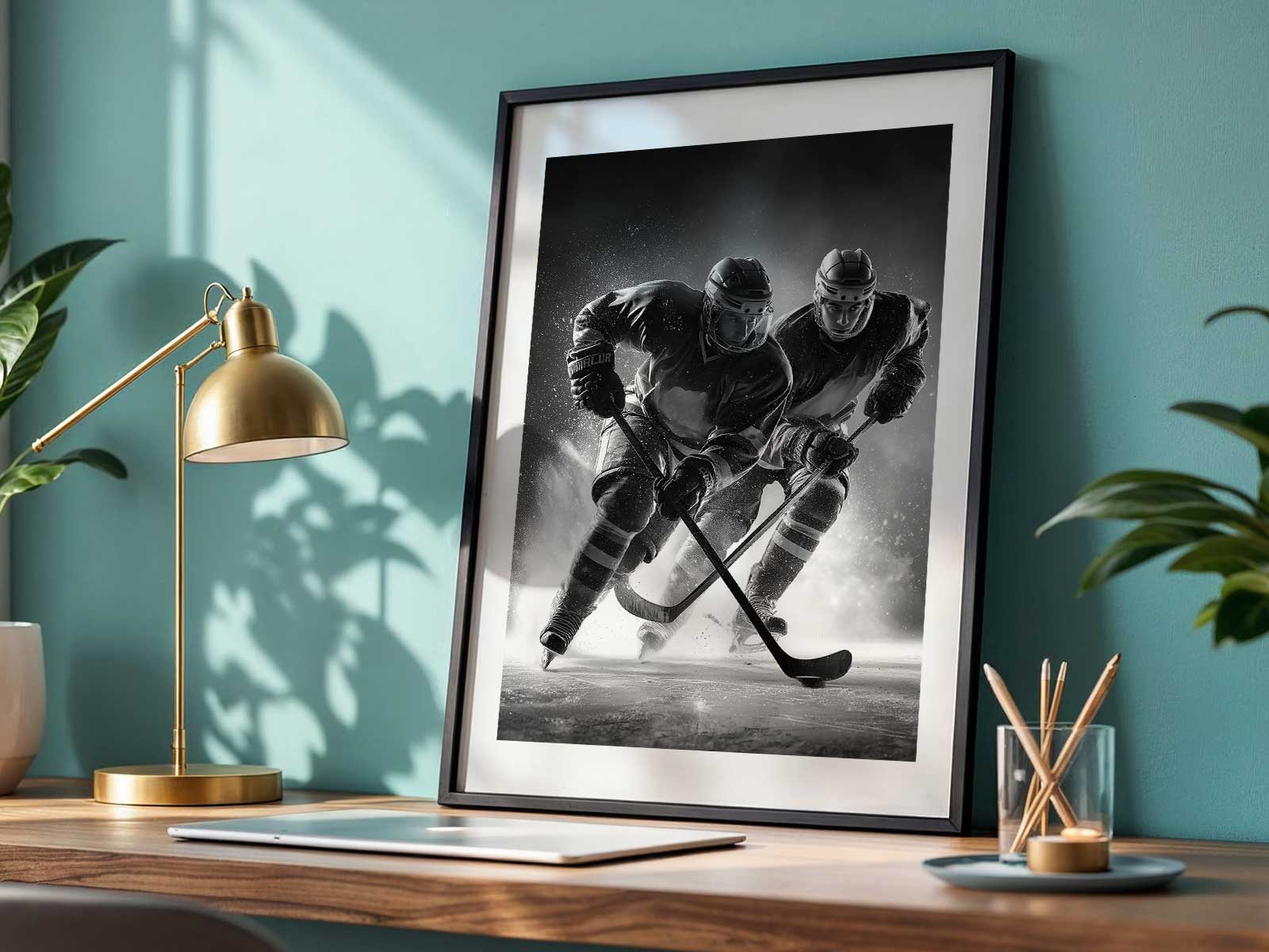
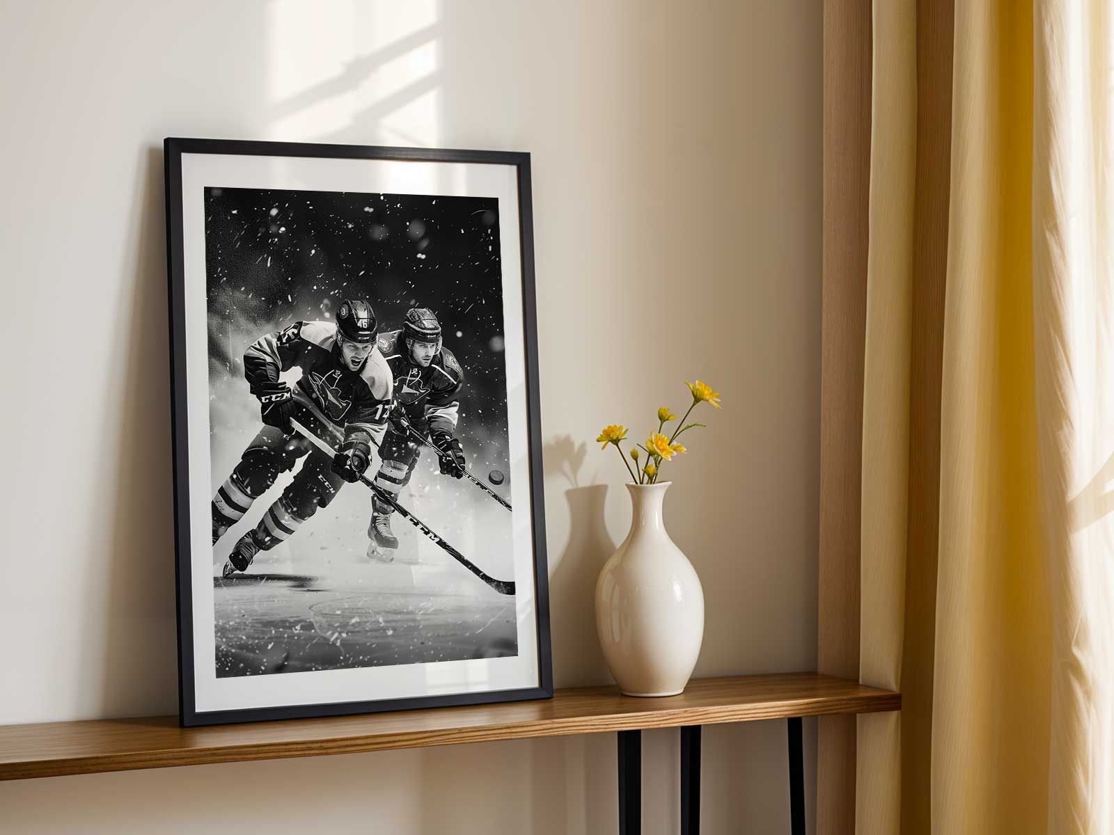
Because hockey imagery is inherently architectural, it pairs well with modern interiors. The rink’s lines echo mid-century geometry; the contrast between fast bodies and static boards creates a push-and-pull that complements clean furniture. In a layered decor scheme, a poster can anchor a gallery wall, or it can stand alone above a sofa to give a room a focused emotional heartbeat. Scale is important: larger prints emphasize motion and surface detail, while smaller framed pieces highlight identity and can be grouped for narrative sequencing.
Finally, great hockey wall art respects the game’s honesty. It doesn’t sanitize the contact or over-glamorize play; instead it honors velocity, texture, and emotion. That fidelity is what makes the work convincing in both fan caves and refined interiors. When speed, ice, and feeling are allowed to work together—when a poster keeps the sport’s truth while composing it with visual care—the result is a piece that looks purposeful on the wall and feels alive every time you pass it.
Author: