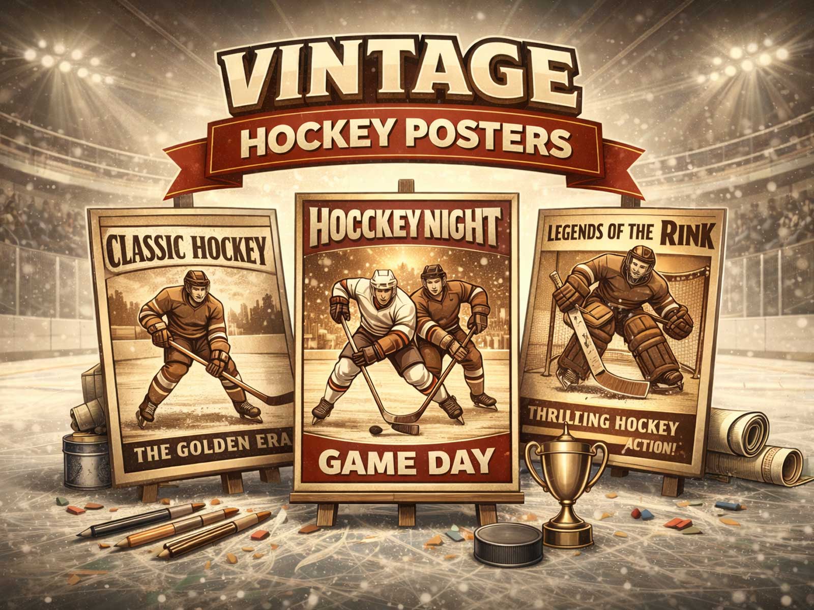
There’s an immediacy to a vintage hockey poster that goes beyond pretty imagery: it reads like a shorthand for a whole era. At first glance the color is slightly muted, the typefaces lean toward condensed, industrial lettering, and the crest or sweater design carries a clarity and economy of line that modern reproductions rarely match. Those cues—palette, graphic heritage, arena atmosphere, and the visible marks of print and time—are the visual vocabulary that gives a retro hockey poster its lived-in authority.
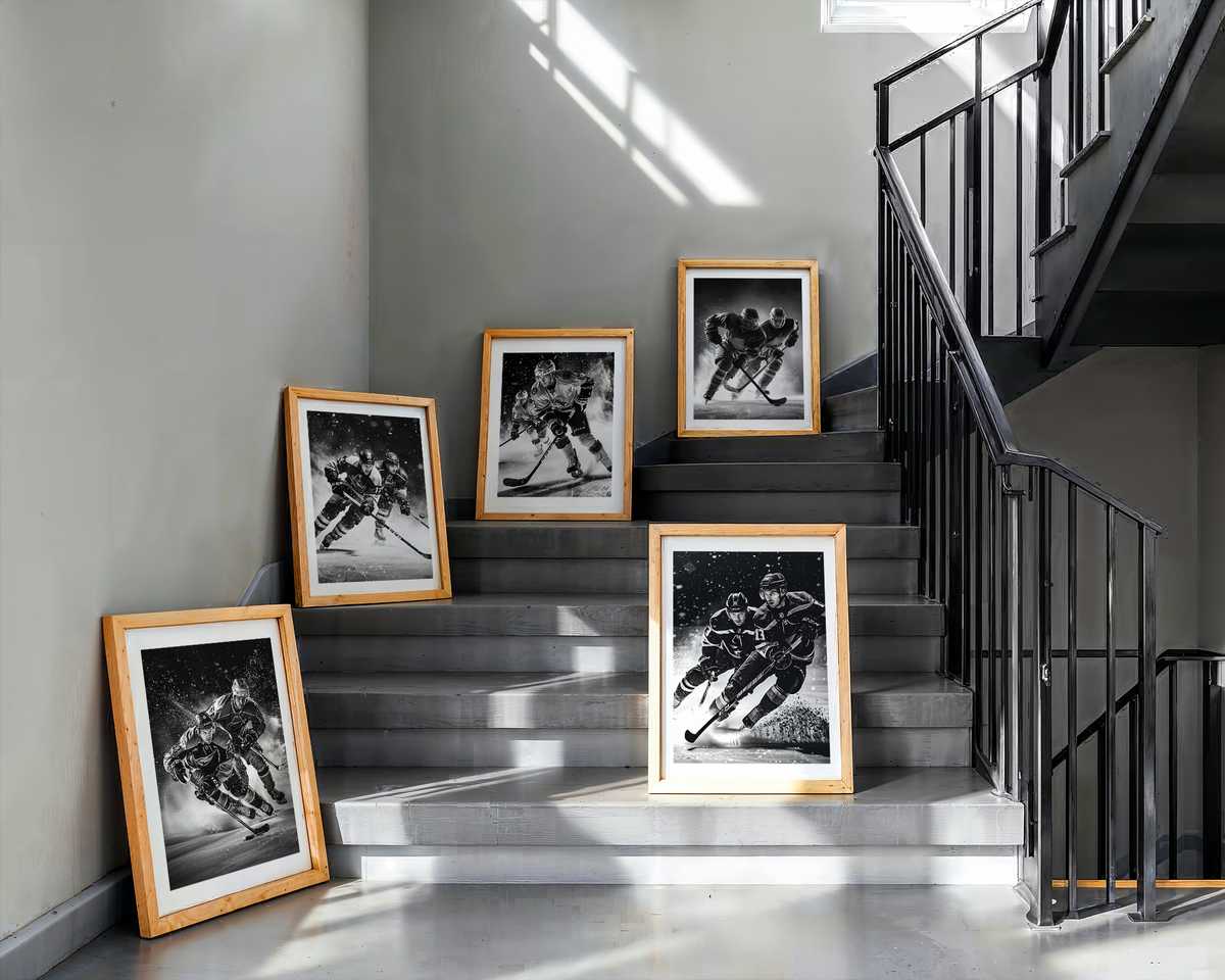
Palette is the poster’s first voice. Rather than neon-bright recreations, authentic-looking vintage pieces use a restrained range of pigments: warm creams, desaturated reds and blues, ink-bleed blacks and paper-tones that suggest circulation and age. These hues do more than signal age; they anchor the image to a tactile memory of sweater wool, wooden boards, and low, sodium-lit arenas. In interior spaces that palette creates an instant, cohesive identity—a fan room or study where the colors feel like they belong to the architecture and to the stories hung on the wall.
The graphic language of old hockey art is economical and purposeful. Team crests and jersey marks were designed to be identifiable at a distance, often simplified for silkscreen and lithograph reproduction. That inherited graphic grammar—bold outlines, compact symbols, and lettering that favors legibility over flourish—delivers an immediacy modern retro styling mimics but often over-embellishes. A genuine vintage feel rests in restraint: a clear emblem, an iconic silhouette, and a compositional balance that reads as both emblematic and intimate.
Texture and print character play a quiet but decisive role. Subtle noise, paper discoloration, slight registration shifts, and the halftone patterns of older print technologies are read by the eye as authenticity. These are not flaws but evidence: of posters folded into travel trunks, glued to arena walls, and passed among fans. When reproduced thoughtfully, that texture communicates provenance and use, which transforms a print from decorative to narrative. It invites touch and close inspection, two behaviors that deepen attachment to an object.
[IMAGE_INSERT_ARTICLE_01]
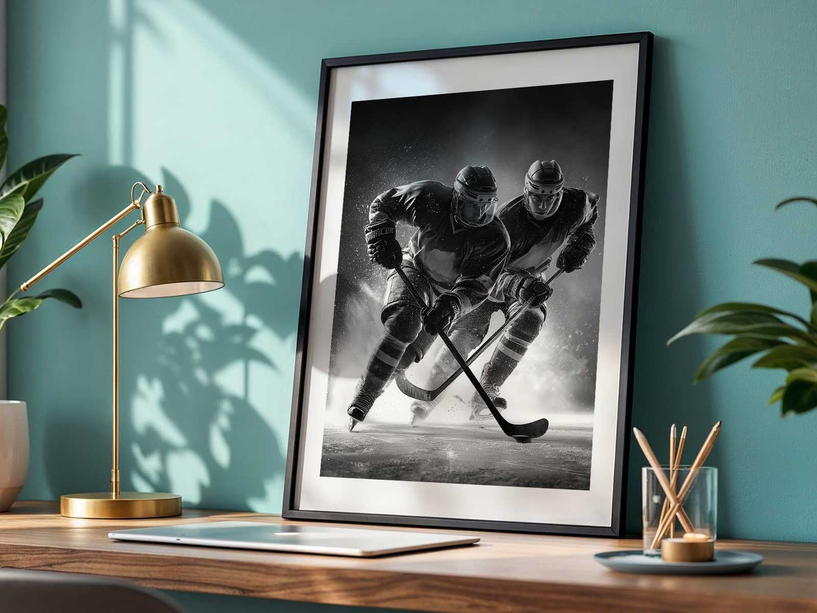
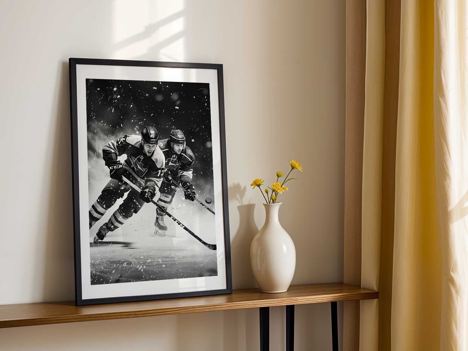
The sense of arena—the smell of skate leather, the hum of a crowd, the geometry of boards and plexiglass—is suggested rather than depicted. Vintage posters often show cropped action, a player in a mid-stride silhouette, or a rink vignette where the background is as meaningful as the subject. This compositional shorthand implies atmosphere. Combined with patina and period typography, it lets a poster evoke winter nights and season-long rituals without literal reproduction of a game photograph.
Finally, the cultural weight of fan memory turns these visual signs into emotional currency. A poster that references an old sweater cut, a forgotten crest variant, or a regional colorway becomes a touchstone for collectors and fans who value specificity. That’s the distinction between an authentic heritage print and generic retro decor: the former feels like a recovered piece of culture; the latter feels like a style choice. For decorators, collectors, and anyone building a fan wall, the difference matters—authentic visuals create a stronger, more personal identity in a room.
In practice, choose a vintage hockey poster for its coherent story: harmonious, era-true colors; crisp, simple crests and typography; visible print character that suggests use; and compositions that whisper of arenas and rituals. These elements combine to make a lasting decorative object—one that reads as both personal memory and cultural artifact, and that anchors a space with the emotional gravity of a true sporting heritage.
Discovering, framing, and living with these posters is less about nostalgia for its own sake and more about inviting a time-tested aesthetic into everyday rooms. The result is decor that looks lived-in by design, not by accident.