How the Florida Panthers Built Their Identity: City, Colors, and the 1996 Moment
The Florida Panthers entered the NHL as an expansion franchise in 1993 with an identity tied to place, conservation and a bold 1990s visual language. Over three decades the club has layered civic outreach, a singular playoff moment and deliberate redesigns to create a franchise culture that matters well beyond Sunrise, Florida.
The short version
The Florida Panthers were awarded an NHL expansion slot in 1993 with a name and early branding explicitly tied to the endangered Florida panther; a surprise run to the 1996 Stanley Cup Final and enduring fan lore (the "rat trick") anchored the team’s cultural memory, while a major 2016 rebrand and anniversary throwbacks have kept the 1990s imagery central to the franchise’s visual identity as it rose again in the 2020s.
What you will learn here
- Why the name and early identity connected the team to regional conservation and state representation.
- How the 1995–96 playoff run created an enduring fan ritual and collective memory.
- What changed in the 2016 visual overhaul and how the team has bridged past and present through anniversary marks and throwbacks.
WHERE THE FRANCHISE BEGINS
The Florida Panthers were awarded as an NHL expansion team and began play in the 1993–94 season. Owner Wayne Huizenga chose the name "Panthers" to draw attention to the endangered Florida panther, explicitly tying the club’s identity to a statewide conservation symbol and positioning the team as a representative of Florida rather than a single city.
THE FIRST IDENTITY OF THE TEAM
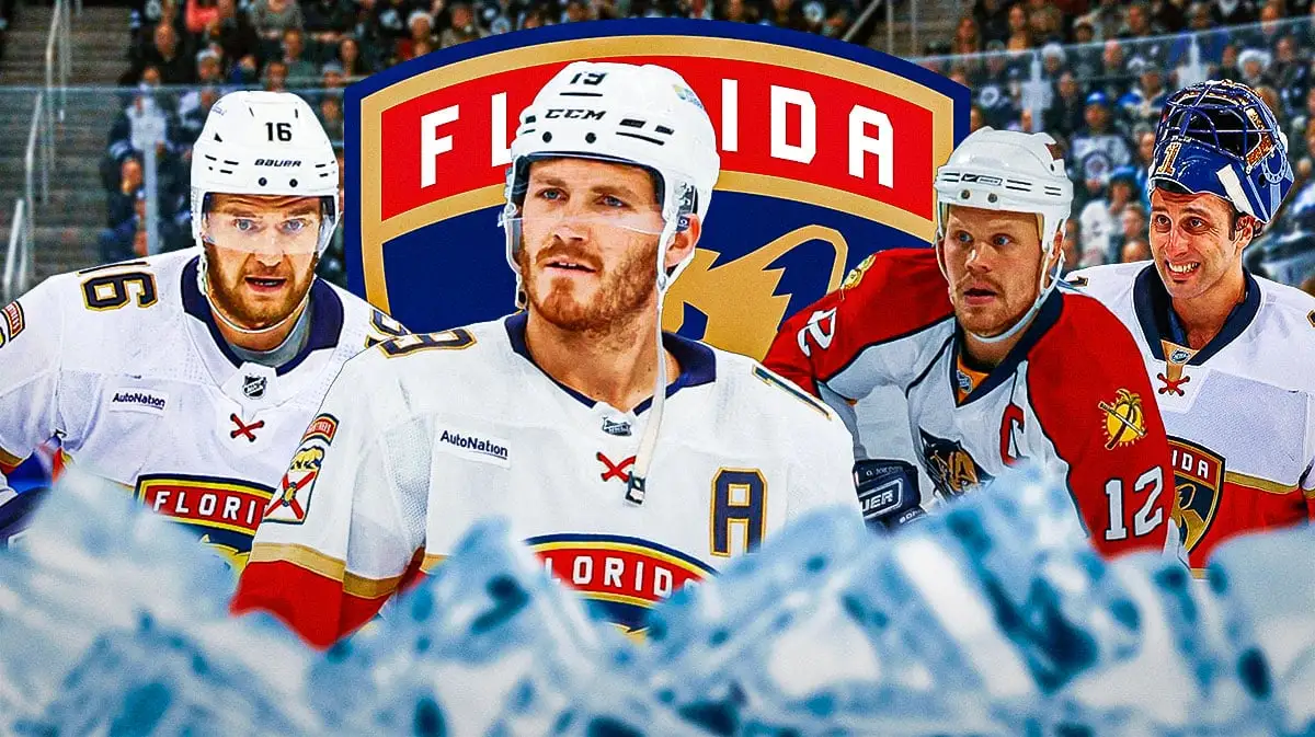
From 1993 through much of the 2010s the Panthers' primary visual language rested on a leaping-panther logo, diagonal or yoke jersey elements and a palette of red, navy blue and yellow (later described in updates as "flat gold"). Those graphics read like a product of early-1990s NHL expansion design: bold, high-contrast and intended to stand out in a non-traditional hockey market.
THE ERA THAT GAVE IT REAL SHAPE
The franchise’s most culturally resonant early era came with the unexpectedly deep 1995–96 playoff run that culminated in the 1996 Stanley Cup Final appearance. That season changed how fans, local media and the NHL remembered the team—turning a young expansion club into a symbol of sudden competitive legitimacy and producing rituals that would follow the franchise for decades.
THE 'RAT TRICK' AND COLLECTIVE MEMORY
One of the most distinctive pieces of Panthers lore emerged from the 1996 run: the "rat trick." The anecdote—rooted in a dressing-room incident involving Scott Mellanby and a rat—led to fans throwing plastic rats during playoff games. That ritual became a defining cultural artifact of the 1996 era and remains a shorthand for how a single season can create persistent fan behavior and communal memory for a young franchise.
MOVES IN LOOK: THE 2016 REBRAND
In June 2016 the Panthers unveiled a major identity overhaul. The redesign introduced a new primary shield logo with a panther profile and standardized the team’s trim and color usage—retaining red and navy while moving to a flatter, more modern "flat gold." The change was an attempt to refresh the club’s visual presence while keeping the panther motif central.
BRIDGING PAST AND PRESENT: ANNIVERSARIES AND THROWBACKS
The Panthers have repeatedly employed anniversary logos and the NHL's Reverse Retro program to reconnect fresh branding with 1990s-era imagery. Milestone marks—like the 25th and 30th anniversary logos—operate as deliberate signals that the franchise values its early visual and sporting history, using heritage graphics to knit together older fans' memories and newer audiences' expectations.
RECENT COMPETITIVE ERA AND CULTURAL WEIGHT
Competitive success in the 2020s—documented in NHL media materials and stats packs—has elevated the Panthers' standing in the league and increased their cultural importance. Those later playoff runs reframed the franchise narrative from a nostalgic 1990s anomaly to a contemporary NHL contender, making the team's history feel continuous rather than a relic of a single decade.
ARENA, MARKET AND COMMUNITY TIES
The team's market footprint in Sunrise and its choice to brand itself with "Florida" reflect a state-level identity rather than a municipal one. From founding, the franchise used conservation messaging around the Florida panther and has leveraged civic ties to anchor the club in the broader South Florida community—an important move for an NHL team outside hockey’s traditional northern footprint.
WHY THE FLORIDA PANTHERS STILL MATTER
The Panthers’ trajectory shows how an expansion club can create durable identity through a combination of place-based symbolism, a single transformative sporting moment, and careful visual stewardship. The 1996 Cup Final run produced rituals and memories that remain potent; the 2016 rebrand modernized the look without erasing its 1990s roots; and recent competitive success has converted nostalgic capital into current cultural relevance.
CONCLUSION
The Florida Panthers are a case study in identity-building for modern NHL franchises: name choice and early visuals tied to regional meaning; an unexpected deep playoff run that created folklore; periodic design overhauls that balance refresh with respect for heritage; and a reinvention in the 2020s that proves early moments can feed contemporary legitimacy. Together these elements explain why the Panthers matter to the NHL’s cultural landscape.
Author: Eric M.