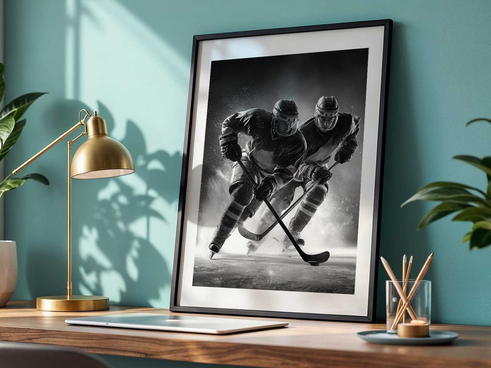
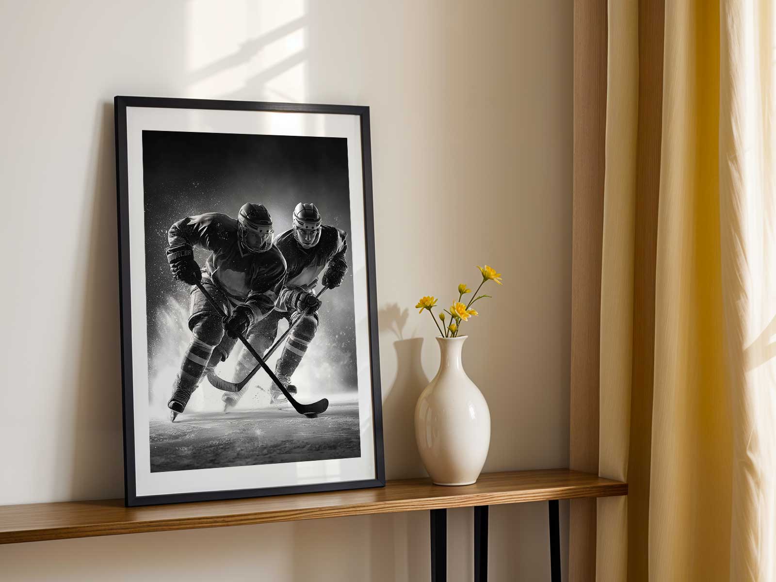
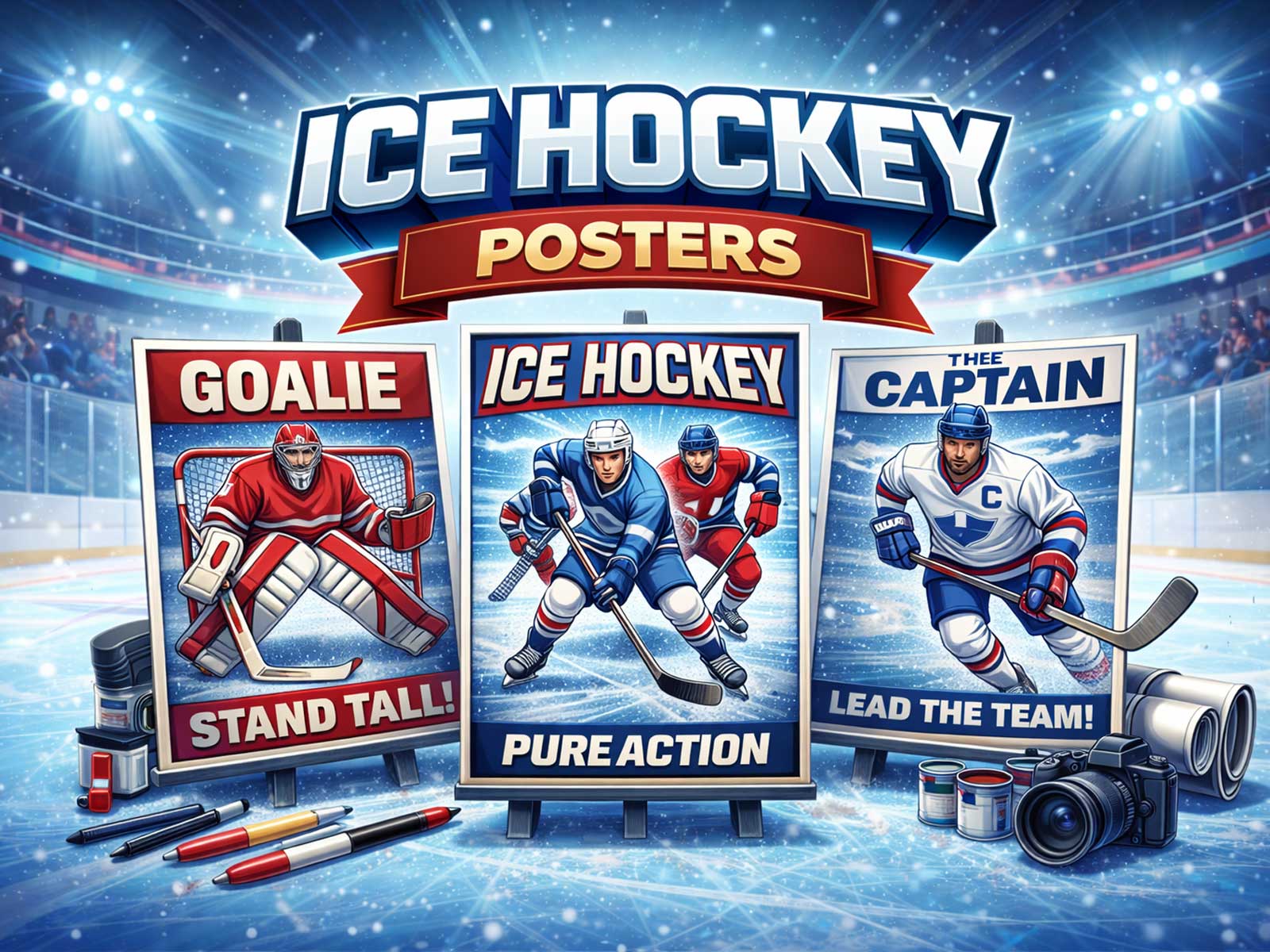
Hockey images move beyond sports photography when they capture the essential tensions of the game: the abrupt impact on the ice, the saturated color of equipment and jerseys, and the freeze-frame of motion that still feels alive. A poster that works as wall art doesn’t simply record a moment; it translates tactile sensations—spray, crash, friction—into a visual language that animates a room. That translation is why hockey art finds a place in bedrooms, offices, fan caves, and minimalist living spaces alike.
The ice itself is a tremendous compositional asset. Its surface is both mirror and texture: beaten tracks, skate grooves and the mist of skated-out frost create subtle grain and directional lines that guide the eye. Photographs and prints that emphasize that geometry use the rink as more than background; the ice becomes an active graphic element, a field of tension that amplifies speed and collision. When a composition isolates a spray of ice or a trailing edge of a stride, it turns movement into an elemental shape that reads at a distance—perfect for wall scale.
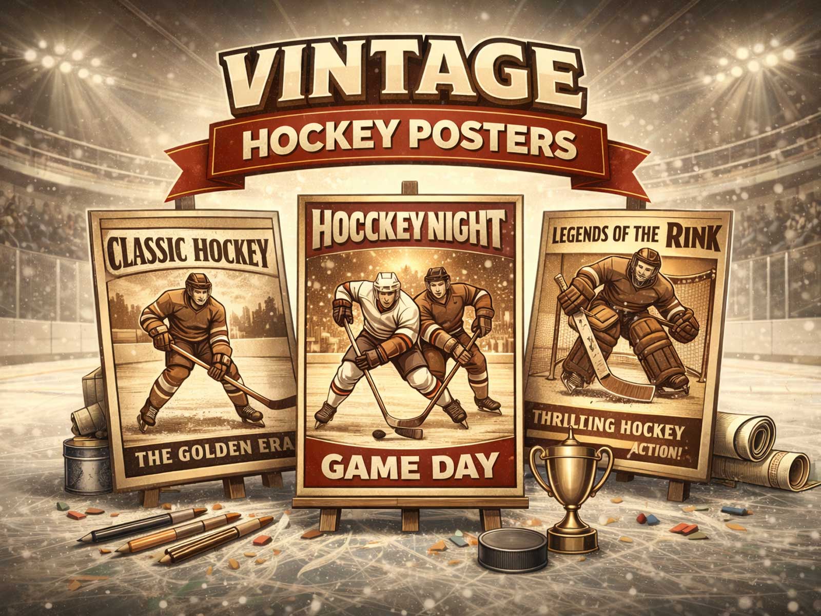
Color does heavy lifting in hockey art. Jerseys, pads and helmets offer bold, emblematic blocks of pigment against the cool neutrals of the rink. That contrast—warm team colors against pale ice and dark arena shadows—creates immediate visual drama. A single saturated crest or the flash of a glove can anchor a composition and double as a focal point for room decor, giving the wall both identity and legibility. Vintage palettes, muted crests and textured paper evoke nostalgia and fit with mid-century or industrial interiors, while modern neon accents and high-contrast prints pair well with contemporary, monochrome spaces.
[IMAGE_INSERT_ARTICLE_01]
Motion in hockey art is seldom literal; it’s about implied force. The most compelling pieces suggest a trajectory—a shoulder drop, the arc of a stick, a puck’s invisible line—so the viewer mentally completes the action. Tension between stillness and implied velocity is what gives the image muscle. That quality makes hockey posters suitable for diverse settings: a study where the restrained energy improves focus, a game room where it heightens excitement, or a living area where it provides a sporty counterpoint to softer textiles.
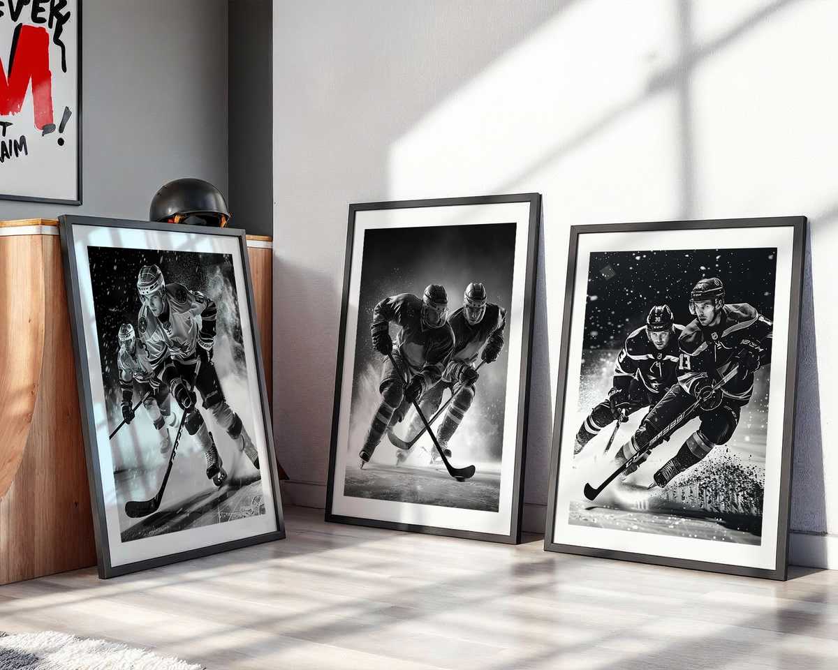
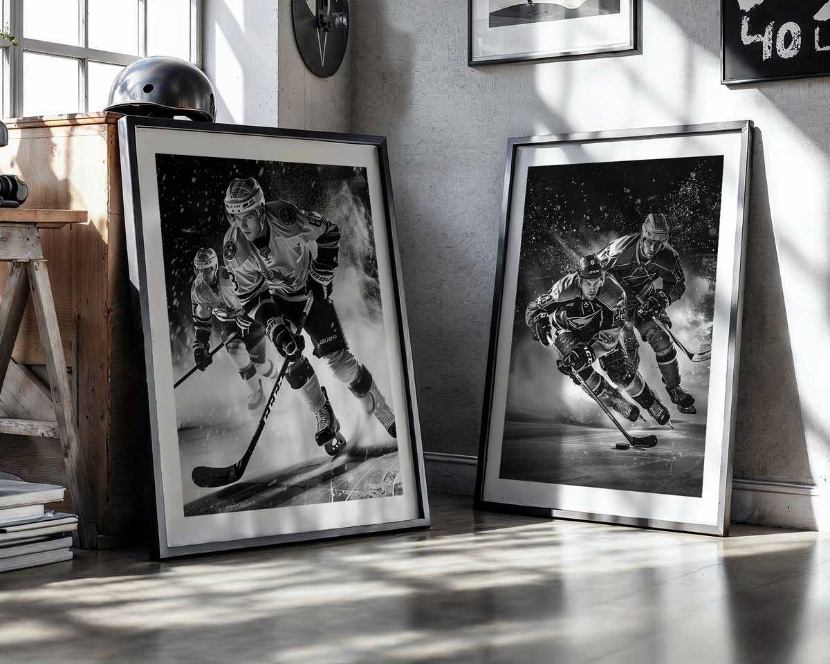
Identity and symbol matter. Crests, numbers and helmet marks read like logos on the wall, giving fans a way to signal allegiance without loud fandom. When a print balances emblematic detail with artistic restraint—cropping a jersey to reveal only a crest or a shoulder— it becomes more universal and more decorative. Collectors often mix eras: a retro-styled screen print beside a high-contrast modern photograph creates a layered narrative of team history and visual taste.
Finally, consider scale and finish. Large-format pieces let texture breathe and reveal the granular drama of ice and fabric up close, while smaller prints can form grids that mimic locker-room order. Matte papers mute glare and enhance the tactile suggestion of ice; gloss finishes heighten color punch when the goal is visual impact. Thoughtful framing—simple wood for vintage moods, slim metal for modern aesthetics—completes the translation from arena moment to considered wall object.
Hockey art succeeds because the sport’s raw materials—speed, soundless impact, emblematic color and geometric ice—are inherently pictorial. The best posters treat these elements deliberately, shaping them into images that look good in a room and feel alive every time you pass them. They are not just reminders of games but pieces that change a space’s atmosphere, adding a cool, kinetic identity that resonates with fans and design-minded viewers alike.